
Practising graffiti letters is less about collecting new effects and more about repeating a small set of visible decisions until they become deliberate. Use the alphabet, not just a favourite name, as the material. A sketchbook makes mistakes easy to inspect; a legal practice wall is where a finished idea meets surface, scale and real surroundings. Skeleton, axis, proportion, spacing, outline and shadow provide comparable progress.
Why letters need practice, not just inspiration
A striking drawing can hide weak construction under colour, arrows or shading. When the same problem repeats across different letters, the underlying weakness becomes easier to see. The purpose of a drill is to isolate one of those problems rather than decorate around it.
Keep older pages. Returning to the same letter forms lets you see whether your choices are becoming clearer. A difficult letter is useful practice because it exposes where your baseline, balance or stroke direction is inconsistent. Treat corrections as observations, not failures.
Drill 1: skeletons and axes
Write the alphabet from A to Z as single-line skeleton letters across a shared baseline. The skeleton is the simplest stroke path that still makes each letter identifiable. Keep letters aligned to the same imagined ground; avoid giving one letter a decorative body while the next is still only a centre line.
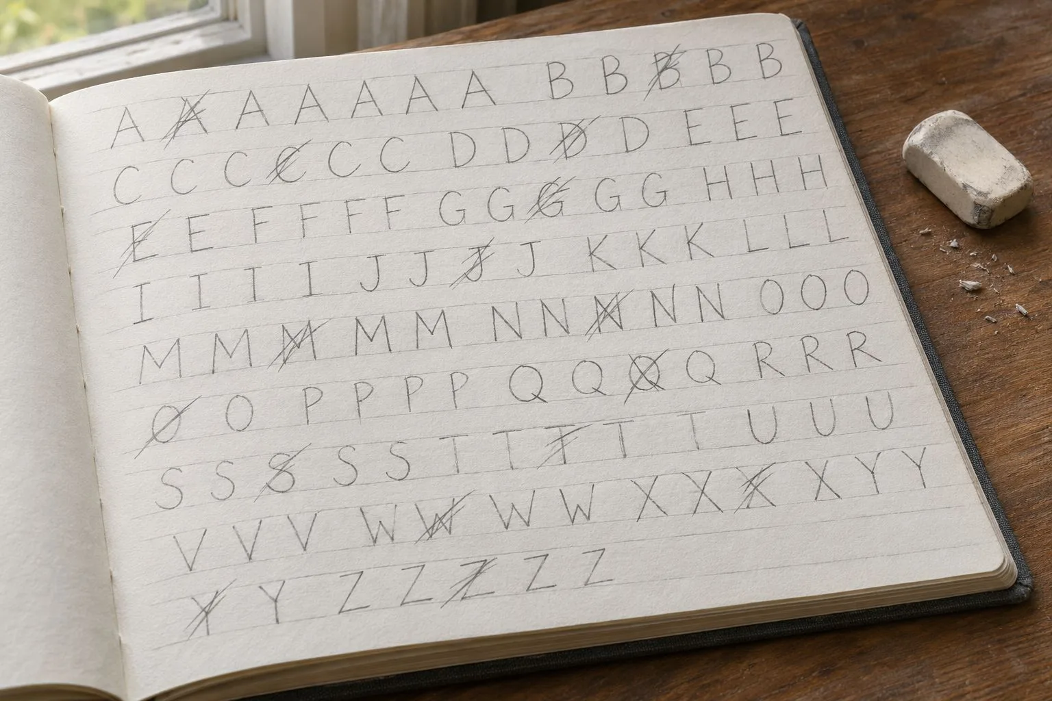
Then redraw the alphabet with a deliberate shared lean. This is the axis drill: decide which way the vertical parts lean and let the alphabet follow that decision. Check: do the letters sit on the baseline, and do their main strokes lean in the same direction? If some seem to fall backwards while others rush forward, revisit their skeletons before outlining them.
Drill 2: proportion and spacing
Turn skeletons into simple letter bodies with comparable visual weight. Keep letter height consistent, but do not force every character into identical width. The narrow I, J and L occupy space differently from wide M and W. A balanced page respects those differences while making the alphabet look like one family.
Leave even visible gaps between neighbouring letters first. Then try deliberate tight overlaps where the edges touch or partly cover each other. The second exercise is useful only when the letter order remains understandable. Check: is the letter height stable, do wide characters feel too heavy, and can you still separate adjacent letters without guessing?
A clear block structure is a foundation for later choices. The block letters guide goes further into that construction. This drill is about balance and spacing rather than copying a particular example word indefinitely.
Drill 3: clean outlines
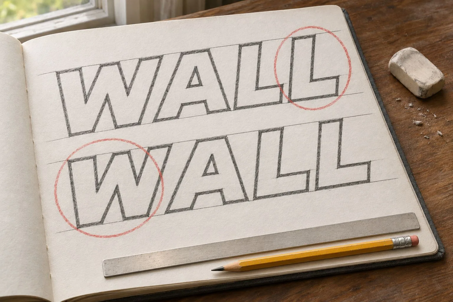
Select an alphabet page with readable skeletons and outline each letter body with one confident contour. Decide how corners should turn and how curved parts should meet straight ones. Try not to redraw the same edge repeatedly: a hesitant accumulation of corrective strokes makes the construction harder to judge.
Check: compare the corners across the alphabet. Does an L have a crisp turn while the next letter has a strangely soft joint? Are outer curves consistently handled? Redraw the weakest characters individually instead of abandoning the entire page. The clean graffiti outlines guide explores more finishing decisions, while drawing bubble letters gives a separate reference for round contours.
Drill 4: shadow and simple 3D
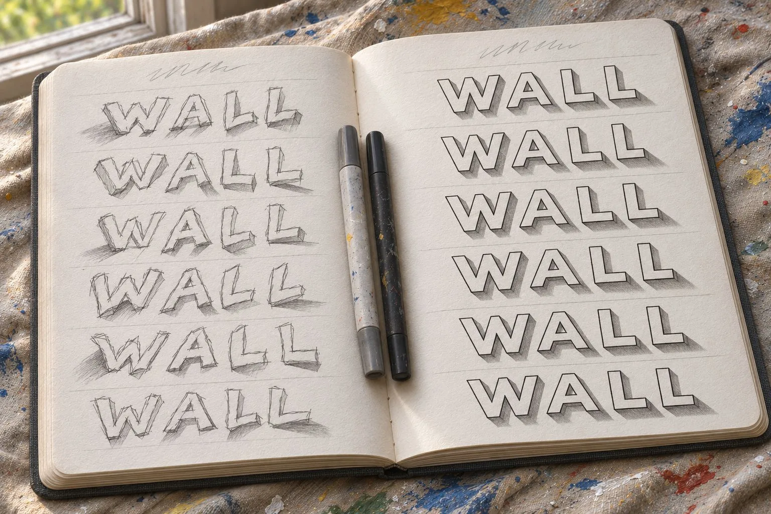
Choose a single imaginary light direction. Add a drop shadow on the same side of every character; keep the shadow's offset direction consistent even when a letter curves or bends. Its purpose is to clarify separation between the letter and background, not to obscure the face.
Next, extend a simple block extrusion from each letter toward one chosen direction. Join matching corners so the side planes read as connected. Check: does the shadow point one way on the W but another on the A? That inconsistent shadow or 3D direction is a common mistake. If it occurs, remove the decoration and restate your shared direction.
Colour should reinforce the drawing, not rescue a confusing extrusion. The fills and fades guide provides a separate reference once the construction is sound.
Building a practice session
A repeatable session is more useful than filling every available page with unrelated ideas.
1. Warm up with skeletons. Write different letters of the alphabet on a baseline; include awkward shapes rather than only familiar ones.
2. Choose one focus drill. Work on a shared axis, consistent proportion, spacing, outlines or a single shadow direction. Do not try to repair every issue at once.
3. Draw one complete word. Bring the chosen focus into a readable composition such as WALL. Notice whether the skill still holds when letters must work together.
4. Self-check. Look at the page from beyond drawing distance, compare it with the warm-up and mark one issue for your next session.
Rotate the focus across sessions. One day may reveal weak spacing; another may show that your outline corners are inconsistent. Keep the practice specific enough that you can explain what improved.
How to judge your own progress
Use dated sketchbook pages side by side, rather than relying on memory of how a drawing felt. Compare the same letters and ideally the same word under similar viewing conditions. Do not judge progress solely by how many colours or details were added.
- Does every letter sit on the shared baseline?
- Do the main strokes follow a consistent axis?
- Are letter heights and visual weights balanced?
- Are gaps deliberate rather than accidental?
- Are corners and curves outlined cleanly?
- Do shadows and 3D extensions keep one direction?
- Is the word readable to someone who does not know it?
- Are errors visible enough that you can choose a specific next drill?
A friend who cannot read the word immediately gives useful information, even if your intention is to make lettering more complex later. Check what caused the confusion: overlapping stems, a lost counter or a decoration that looks like another letter.
From the sketchbook to a legal wall
Once a sketch is readable and passes your own checks, consider painting it on a designated legal practice wall or a surface where the owner has explicitly given permission. Confirm the rules before working; the legal graffiti spots guide explains what to verify. Do not assume that old graffiti grants permission for a new piece.
The wall introduces texture, changes in light and the need to read the whole word from a path. Those conditions expose construction weaknesses that were less obvious on paper. The goal is not to reproduce every pencil mark, but to carry the same consistent decisions into a real place.