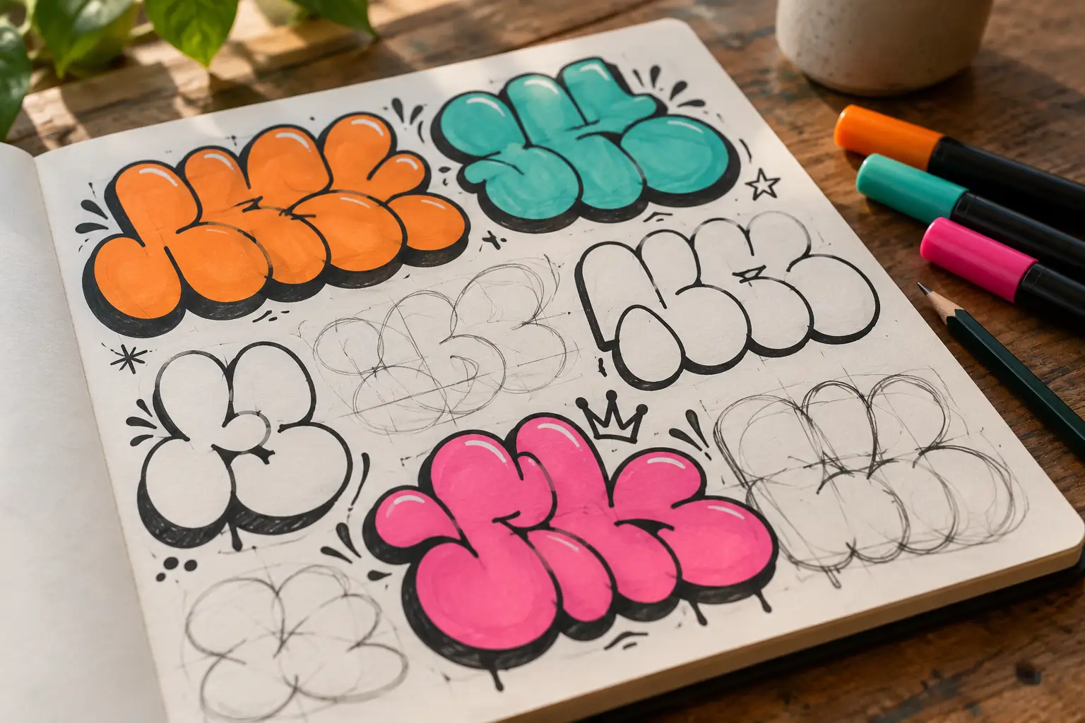
Bubble letters are the first real step in graffiti lettering: round, heavy and easy to read. This guide builds them the way experienced writers do, from a plain skeleton to a full A-Z alphabet, a balanced word and a simple throw-up, with short drills you can repeat on paper.
Start with a simple letter skeleton
Bubble letters begin as ordinary letters. Before drawing a thick outline, write one capital letter with a single line, as if you were using a pencil to write a plain alphabet. This line is the skeleton. It decides the letter's height, width, slant, and basic route.
Add a light baseline and cap-height line first. Keep the skeleton between them, then mark a center line if the letter needs symmetry. A beginner-friendly skeleton should be simple enough to recognise at a glance. Avoid bends, arrows, and extra terminals for now.
Check three things before moving on:
- Proportion: Does the letter fill the same height as its neighbours?
- Structure: Are the main verticals, curves, and diagonals easy to follow?
- Counter space: Is there room inside letters such as A, B, D, O, P, and R?
Draw the same skeleton three times. Make one narrow, one average, and one wide. This small comparison teaches you more than decorating the first version immediately. Choose the clearest skeleton, erase stray construction lines, and keep it light enough to draw around in the next step.
Inflate the skeleton into a bubble
Imagine placing a soft tube around every stroke of the skeleton. Draw a new line on both sides of each stroke, keeping roughly the same distance from the center. At the ends, connect those lines with round caps. Where strokes meet, replace sharp corners with smooth curves.
Work slowly at first. Rotate the paper if that helps your wrist make a clean arc. The goal is not a mathematically perfect border; it is a consistent visual weight. If one side swells much farther than the other, the letter can look bent even when the skeleton is straight.
Counters need special attention. As the letter grows thicker, the hole inside an A, B, D, O, P, or R becomes smaller. Draw that inner shape early and leave more room than seems necessary. It is easy to tighten a counter later, but difficult to reopen one after the outline is finished.
Once the outside contour works, erase the skeleton. Look at the letter from a few steps away or reduce it to a thumbnail on your phone. Ask whether it is still readable without the center line. If not, simplify the outline: widen a counter, separate two touching curves, or remove a bump. A good bubble letter feels inflated, but its original structure remains visible.
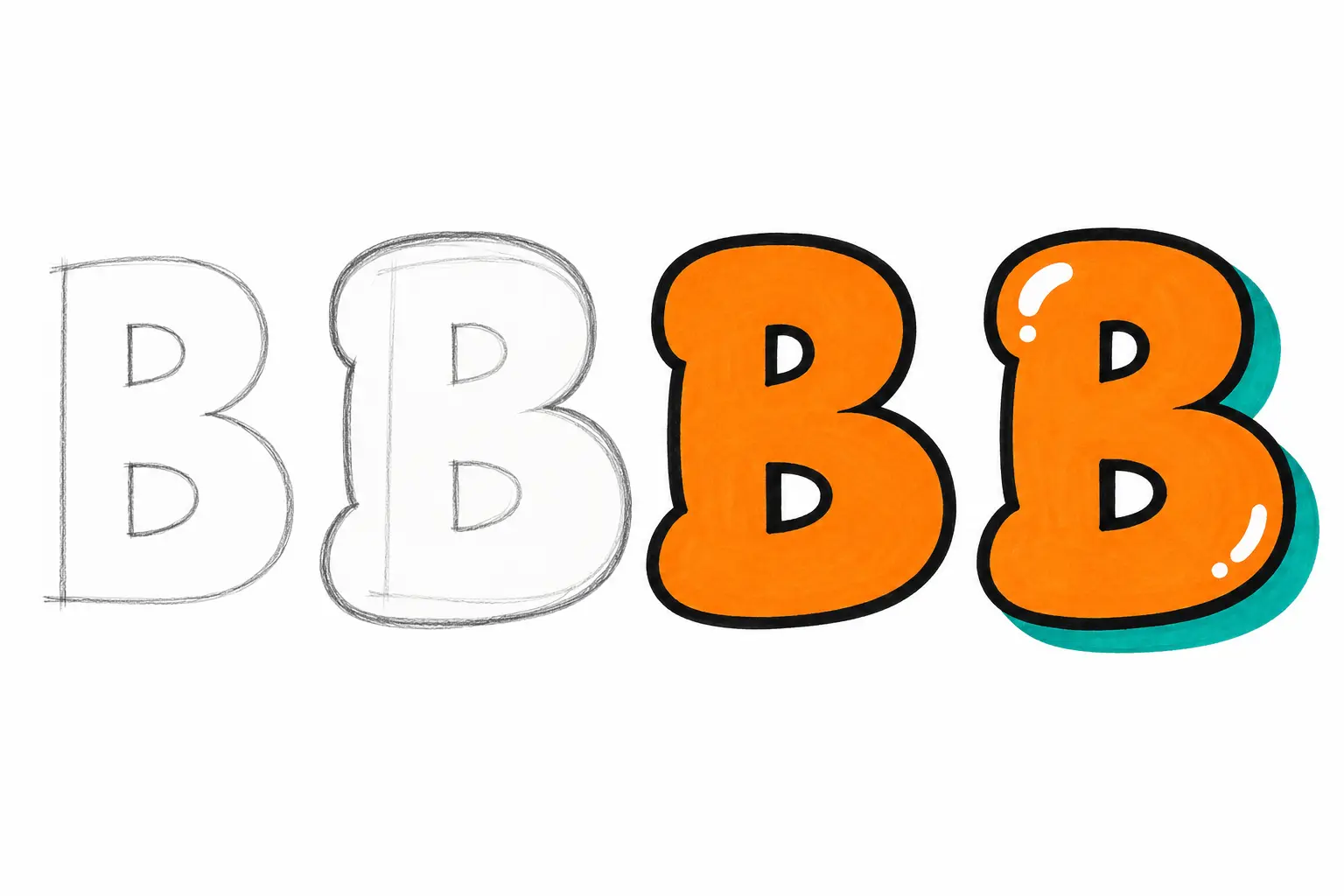
AI illustration: one letter, four passes - sketch, bubble outline, fill, shadow and highlights.
Build the graffiti alphabet in shape families
Do not try to invent 26 unrelated designs. A consistent bubble alphabet comes from repeating a small set of curves, bars, joints, and terminals. Practise letters in families so each successful decision can carry into the next one.
- Round letters: C, G, O, Q, S. Begin with O, then open or adapt its curve for C, G, and Q. Build S from two rounded bowls with a clear middle pinch.
- Straight letters: E, F, H, I, L, T. Keep vertical and horizontal parts equally thick, use matching round terminals, and leave clear gaps between arms.
- Bowl-and-stem letters: B, D, P, R, U. Attach soft bowls to a main stem. Preserve B's counters and R's bowl; build U from two stems and a deep curve.
- Diagonal letters: A, K, M, N, V, W, X, Y, Z. Inflate both sides evenly, keep A open, and repeat related angles through M and W.
- Mixed letters: J. Join a straight upper stroke to a rounded hook using the same terminals as the other families.
Place the full A-Z row on one sheet and look for consistency rather than novelty. Are the round letters equally soft? Are the straight letters equally heavy? Do all terminals have a shared shape? Fix the family that breaks the rhythm before adding effects.
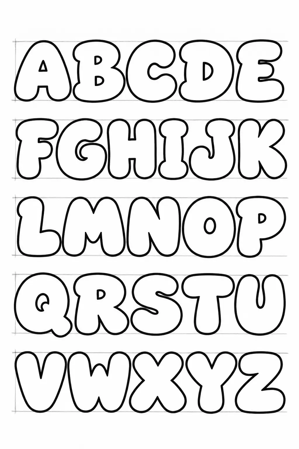
AI illustration: an A-Z practice sheet - same height, same stroke width, open counters.
Turn separate letters into a balanced word
Write the whole word as skeletons before inflating any letter. This lets you adjust the composition while the lines are still easy to move. Set a baseline, cap height, and rough total width, then place the first and last letters. Fit the middle letters between those anchors.
The empty spaces should feel related, even when they are not identical. Round letters create different gaps from straight or diagonal letters, so judge spacing by eye rather than measuring edge to edge. If a gap looks like a hole in the word, move the skeletons closer before adding width.
Small overlaps can help the word hold together. Choose a clear stacking order, such as left letter in front of right letter, and use it consistently. At every overlap, stop the line of the letter behind. Two complete outlines crossing through each other create a knot instead of depth.
Try this simple sequence:
1. Draw the word as light skeletons.
2. Mark where letters may touch or overlap.
3. Inflate every letter to a similar width.
4. Clean up the foreground edges at each crossing.
5. Check the word as a silhouette before adding color.
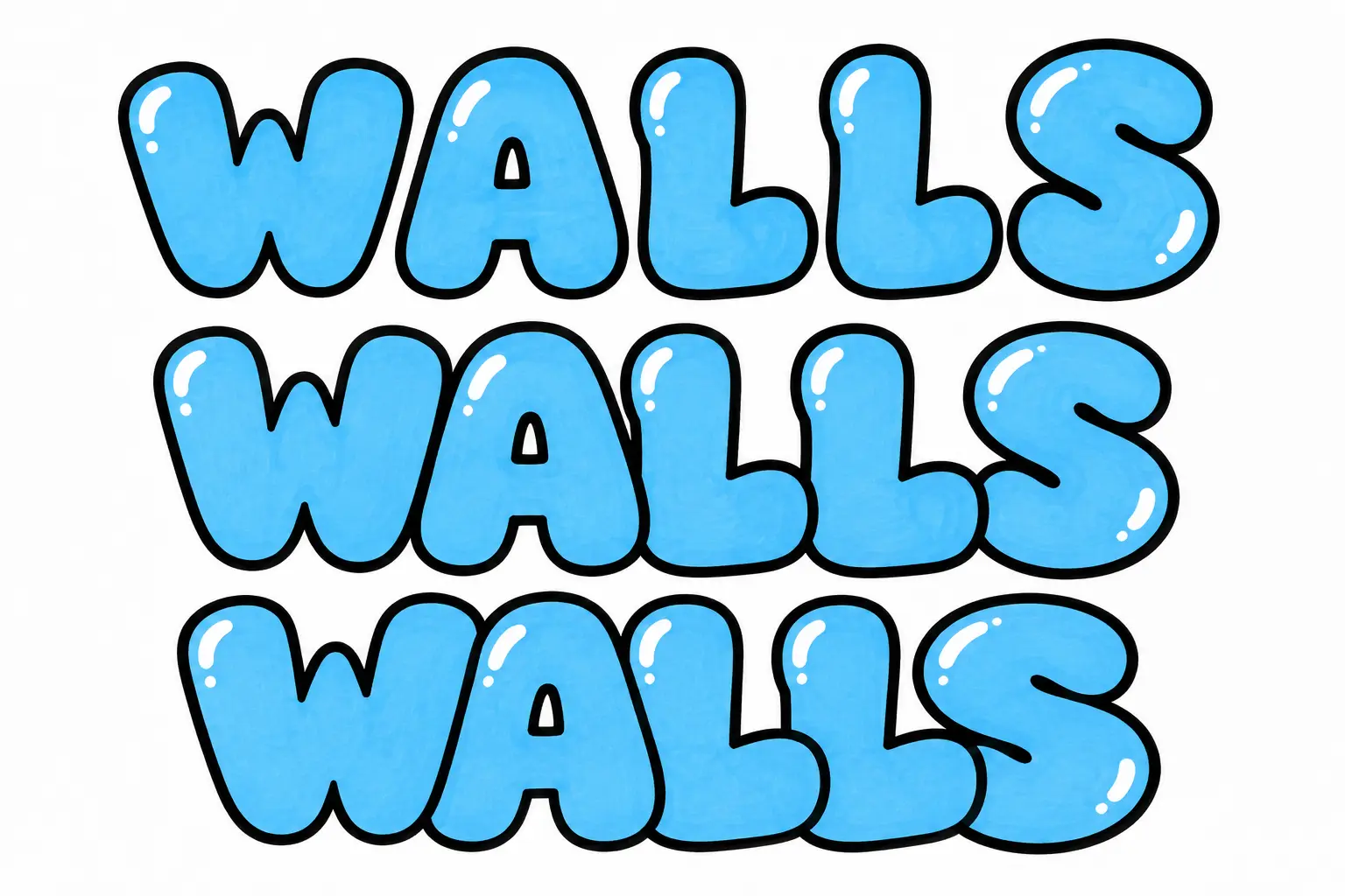
AI illustration: overlapping letters with one clear front-to-back order.
Step back from the page. The word should read first as one balanced shape, then as individual letters. If one letter dominates, reduce its width or simplify its outer contour rather than crowding the rest of the word around it.
Add outline, fill, shadow, and highlights
Effects work best when each one has a separate job. Keep the letter fill readable, use the outline to divide forms, and let the shadow show depth. Adding everything at once makes errors difficult to diagnose.
Work in this order:
1. Clean outline: Trace the final letter contour with an even, dark line. Break the line cleanly where one letter passes behind another.
2. Fill: Use one flat color first. Once the shape reads clearly, try a simple two-color split, dots, or broad stripes without covering the counters.
3. Shadow or 3D: Copy each visible edge a short distance in one direction, such as down and right, then connect the matching corners. Keep that direction and distance consistent across the word.
4. Outer keyline: Add a thin border outside the main outline only when the word needs more separation from its background.
5. Highlights: Place a few short marks on the same upper side of the letters, as if one light source were hitting every bubble.
Test the design in grayscale. If the fill and outline have nearly the same value, the letters may merge from a distance. Increase the contrast before adding more detail. Reserve the brightest color for small accents instead of spreading it everywhere.
On paper, coloured pencils or markers are enough to test the order. If you later transfer the design to a permitted wall, keep the same pass-by-pass plan and check the whole word from a safe viewing distance between layers.
Move from bubble letters to a simple throw-up
A throw-up uses the same basic ideas as bubble lettering: a readable skeleton, thick rounded forms, compact spacing, and a clear outline. The difference is in the design goal. A beginner bubble-letter study may be carefully polished, while a throw-up reduces the word to a simpler, more repeatable shape.
Start on paper with a short name of three to five letters. Draw ten small versions using only an outline. Look for places where neighbouring letters can share a curve, tuck together, or overlap without losing their identity. Remove details that slow the shape down or make it harder to repeat.
Then choose one version and make three controlled passes:
- outline only,
- outline plus one flat fill,
- outline, fill, and one consistent shadow.
Do not confuse simplicity with carelessness. Counters still need room, overlaps still need a front and back, and the word still needs a balanced silhouette. Practise throw-up lettering in a sketchbook, on your own panels, or on walls where you have clear permission. For help checking appropriate places, read Where is graffiti legal?.
Use short drills to improve the whole alphabet
Consistent bubble letters come from repetition with a clear focus. A full decorated word can hide a structural problem, so use short drills that isolate one skill at a time.
Even-width drill
Draw I, H, O, and S as skeletons, then inflate them with the same visual thickness. These shapes reveal whether straight, round, and changing curves belong to one alphabet.
Counter drill
Fill a row with A, B, D, O, P, and R. Draw the inner spaces first, then build the outer contours around them. Make each letter heavy without closing its counter.
Spacing drill
Choose a five-letter word and draw it three ways: separated, touching, and slightly overlapping. Circle the version that reads best from across the room, then note which gaps made the difference.
Shadow drill
Draw one straight letter and one round letter. Project both down and right by the same distance. Compare every corner and curve before filling the shadow.
Alphabet drill
Draw A-Z at thumbnail size using one terminal shape and one outline weight. Mark the three letters that look least related to the rest, then redraw only those. Repeat until the row feels like one set.
Save dated practice pages instead of erasing every imperfect attempt. The comparison will show whether your width, spacing, and counters are becoming more consistent. When rounded forms feel controlled and you want to build denser connections, sharper extensions, and more complex overlaps, continue with the wildstyle graffiti guide.
Frequently asked questions
How do you draw bubble letters step by step?
Draw a simple single-line skeleton, add an even border around both sides of each stroke, round the ends and corners, then erase the skeleton. Finish with a clean outline, flat fill, consistent shadow, and a few highlights. Check readability after every stage instead of waiting until the decoration is finished.
What is the difference between bubble letters and a throw-up?
Bubble letters are rounded letterforms that can be drawn slowly as a study or polished composition. A throw-up applies similar rounded construction to a compact, simplified word designed to be repeatable. Both should be practised on paper, personal panels, or legal walls with clear permission.
How do I make a bubble-letter alphabet look consistent?
Use the same cap height, visual stroke width, corner softness, and terminal shape across A-Z. Practise letters in round, straight, bowl-and-stem, and diagonal families, then place the full alphabet on one page to spot forms that break the rhythm.
Why do my bubble letters look uneven?
The usual causes are an unstable skeleton, changing width around the stroke, cramped counters, or spacing adjusted too late. Return to light construction lines, compare both sides of each stroke, and solve the whole word before tracing the final outline.