
Graffiti block letters are useful because they expose the decisions that more expressive styles can hide. A straight stem shows whether your widths match. A plain counter shows whether the letter has enough air. A simple word makes uneven spacing obvious. Learn those relationships on paper first, then scale the same construction onto a legal wall rather than trying to improvise a style at full size.
Why start with block letters
Block letters reduce the alphabet to strokes, counters and spaces. Their straight edges make proportion easy to compare, and their limited shapes help you see whether the word sits on one baseline. Those are not school exercises to discard later. The same control supports rounded letters, throw-ups and more complex lettering.
Readability is the first check. Draw a word, put it down for a minute and then look at it from across the room. If one letter disappears or two letters merge, correct the skeleton before adding an outline. The types of graffiti styles overview shows how a strong basic structure continues through other approaches.
Setting up a simple grid
Draw a baseline and a cap line, then divide the height between them into five equal units. For a first alphabet, make the main stroke roughly one fifth of the letter height. A letter 10 grid squares high would therefore begin with strokes about two squares wide. This is a starting proportion, not a rule for every design.
Add a midline where crossbars need to align. Mark the left and right boundaries of each letter before drawing its finished edges. Use light pencil so construction lines can be corrected. Keep the same height and main stroke width across the page; changing both at once makes it difficult to tell which adjustment improved the form.
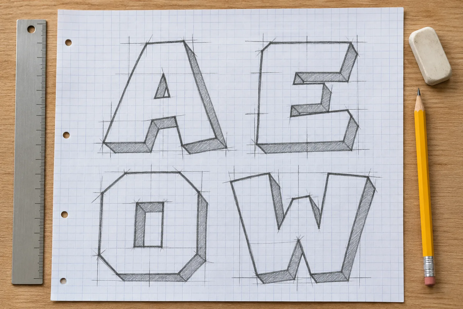
The grid is a measuring aid, not part of the final letter. Once the proportions hold together, redraw the same letters on plain paper with only a baseline and cap line. That step tests whether you understand the relationships instead of copying squares.
Drawing the alphabet
Practise families that share construction. E, F and H are built from vertical stems and horizontal arms. Draw the stems together first, then compare the crossbars. O, C and G begin from the same rounded outer form; the opening or added bar changes the letter without changing its basic mass. A, V and W use diagonals, so they teach how angled strokes meet the baseline and cap line.
Build the skeleton before the outer contour. For E, place one vertical and three horizontals, then give each stroke the chosen width. For O, draw the outer shape and inset a smaller version to create the counter. For A, establish the two diagonals and their meeting point before positioning the crossbar. Keep the interior spaces large enough to survive an outline later.
Do not force every letter into the identical box. Consistent height and stroke weight matter, but an O may need to extend slightly beyond a flat neighbour's top and bottom in a finished drawing to look equally tall. Treat that as an optical adjustment after the grid-based version reads clearly.
Spacing a word
Start with letters close but not touching. Measure the visible negative space, not only the distance between bounding boxes. Two straight sides, such as H next to E, can sit at a regular gap. A round letter leaves empty corners, so O beside a straight letter often needs to move closer for the space to look equal.
Diagonal letters create larger wedges of empty space. A next to V or W may also need a tighter optical gap, but the strokes should not collide. Cover the rest of the word with a sheet of paper and inspect one gap at a time. Then uncover everything and check the whole rhythm; locally equal gaps can still make one end of a word feel crowded.
Write the word several times before decorating it. On the first pass, focus on width. On the second, adjust only gaps. On the third, compare the counters. Keeping each pass focused makes the cause of an improvement visible.
Outline and a simple 3D shadow
Add one outline weight around the entire word. Follow the letter edges at a consistent distance, including inside counters. If the outline closes a counter, enlarge that space in the base letter instead of thinning the outline only at the problem spot.
For a simple 3D shadow, choose one direction and one depth for the whole word. Down and left is easy to plot: copy each relevant corner the same distance down and the same distance left, then connect the original corner to its copy. Repeat that vector on every letter. Do not let one letter project right or twice as far as its neighbour. Fill the projected faces with one darker value so the direction reads immediately.
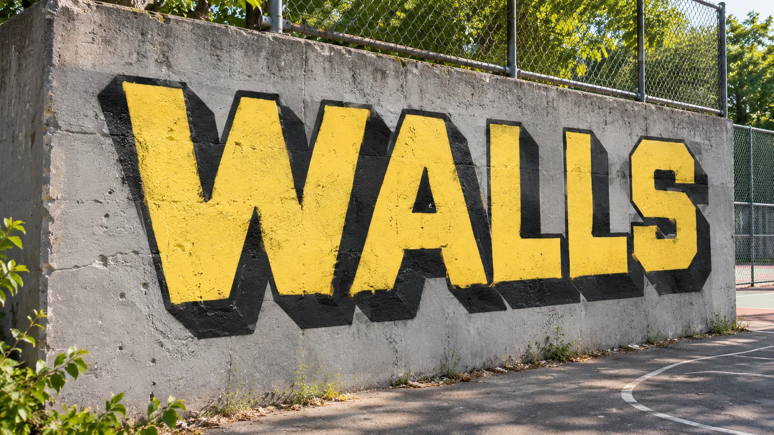
Check the shadow before adding colour. If it looks inconsistent in pencil, a dark fill will make the error more visible, not hide it.
From paper to a legal wall
Use a wall only when painting is explicitly allowed or you have permission. Confirm the permitted area and current rules with the wall operator or owner; the legal graffiti spots guide lists practical checks.
Scale the sketch with a larger grid. Draw a square grid over a copy of your paper design, then mark the same number of much larger squares on the wall using chalk or a light paint colour that your fill can cover. Transfer where each stroke crosses the grid rather than guessing the whole letter at once. Step back after the outer construction, because a line that looks straight at arm's length may not sit correctly across the word.
Paint the fill, then the outline, and add the 3D faces in the single direction planned on paper. Keep the ground protected and paths clear. When the block word is readable and its spacing survives at wall size, move to how to draw bubble letters. The rounded forms will feel less arbitrary because the proportions underneath already work.