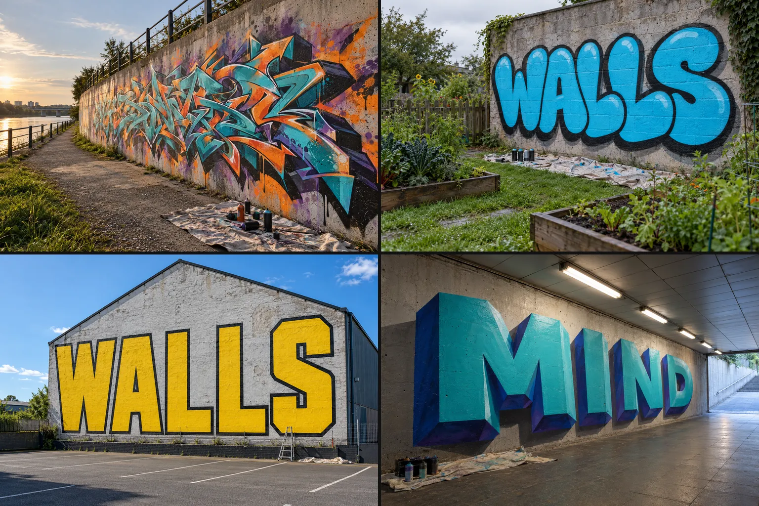
Graffiti is not one style but a family of them, and each one answers a different question: how fast, how big, how readable, how much paint. This guide walks through the eight styles you will meet on almost any legal wall, from a one-colour tag to a full 3D piece, shows what each one looks like, and suggests the order in which to learn them.
The styles at a glance
- Tag: low to medium readability, 1 colour, seconds on a wall. Practise on paper with marker drills.
- Throw-up: medium readability, 2 colours, 5-20 minutes. Paper first, then a small panel.
- Bubble letters: high readability, 2-3 colours, 30-90 minutes. Paper first, then a panel.
- Blockbuster: very high readability, 2 colours, 2-4 hours. A large legal wall and rollers.
- Wildstyle: low readability on purpose, 3 or more colours, several hours to a day. Sketchbook first.
- 3D style: high readability, 3 or more colours, several hours. Sketchbook and light studies.
- Stencil: high readability, 1-2 colours, minutes to spray but 1-3 hours to cut. Card and a practice board.
- Characters: not lettering, 3 or more colours, 1-4 hours. Sketchbook.
Times are rough and assume a prepared surface and some practice; your first attempts will take longer, and that is fine.
Tags: the signature
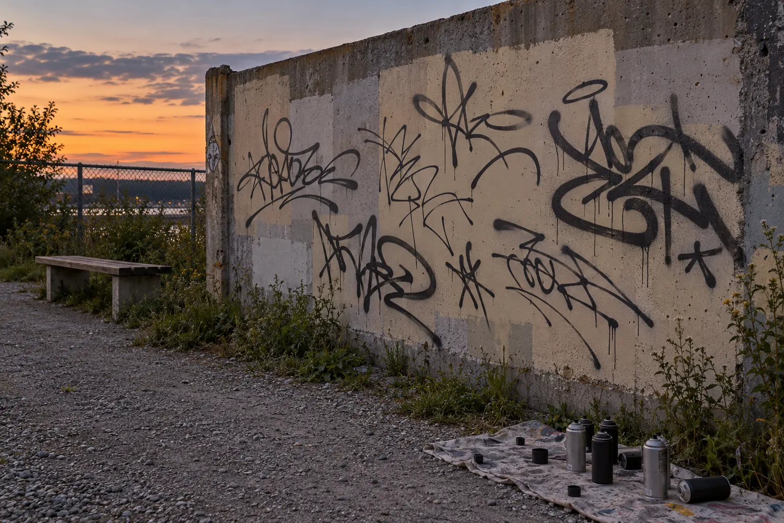
A tag is a writer's name written in one colour, in one continuous movement where possible. Everything else in graffiti grows out of it: the letters you develop for bubble letters, throw-ups and wildstyle start as the shapes your hand learns while tagging.
What makes a good tag is control, not size. Look for even line weight, a consistent slant, letters that sit on the same baseline and a confident start and finish to each stroke. Writers call the personal way of drawing these letters a "handstyle", and it takes years to settle.
How to practise:
- Fill a page with the same name 50 times at the same height. Then fill a page with it twice as fast.
- Try three tools: a pencil, a broad marker and a thin marker. Each one shows different weaknesses.
- On a wall, practise only on a legal panel. A tag on a surface you do not have permission for is vandalism in almost every country, and it is the fastest way to get a legal wall closed for everyone.
Throw-ups: speed over detail
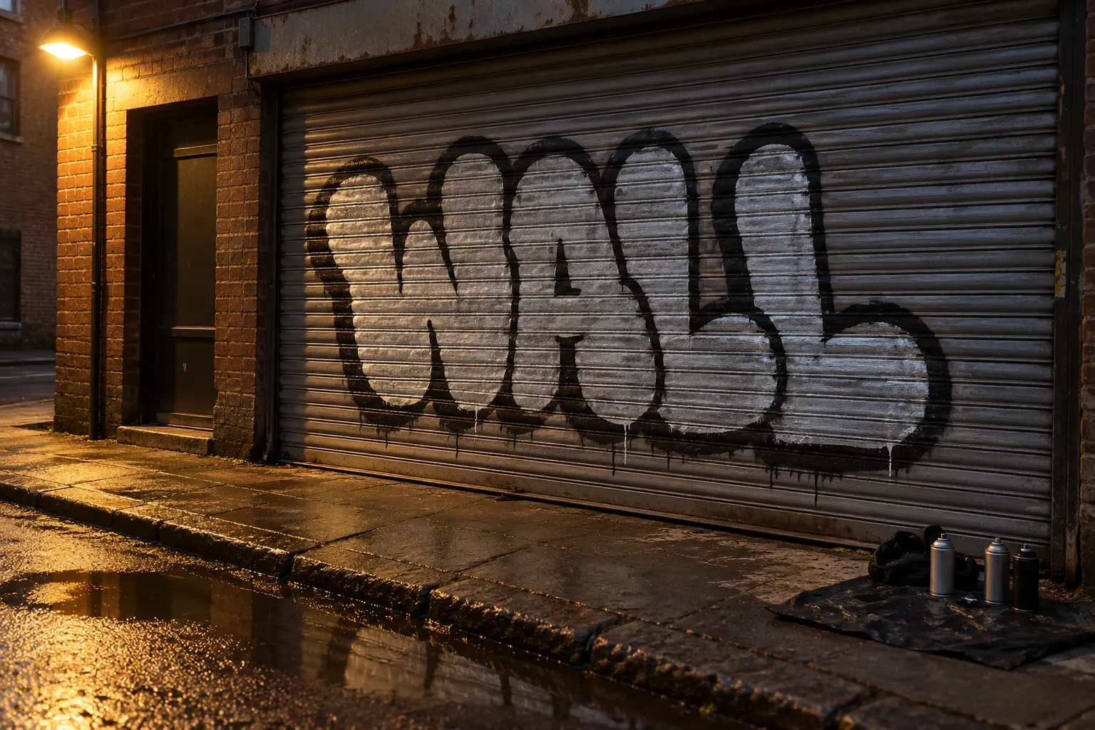
A throw-up sits between a tag and a full piece. It uses rounded, compressed letters (usually two to four of them), one fill colour and one outline colour, and it is meant to be painted quickly. Silver fill with a black outline is the classic combination because both cover well in one pass.
The look is deliberately loose: the fill can be patchy, drips are normal and the letters lean into each other. What still matters is the silhouette. A good throw-up reads as one compact shape from across the street, even if the individual letters are hard to pick out.
Practise it in three passes, the same order you would use on a wall: a fast fill shape, then the outline, then a few cuts or a thin second outline to clean the edges. Time yourself on paper; aim to finish a three-letter throw-up sketch in under two minutes.
Bubble letters: round and readable
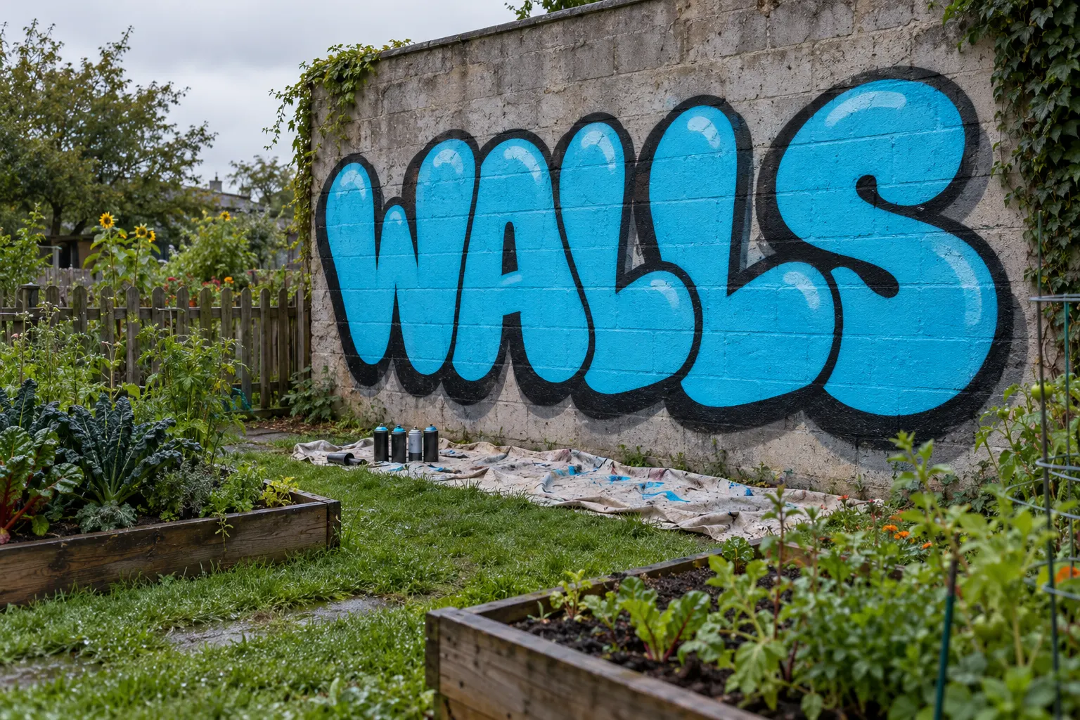
Bubble letters are inflated, rounded letters that overlap slightly, with a flat fill, a solid outline and a simple shadow. They are the easiest style to read and the friendliest one to learn, which is why most writers start here.
The method is simple: write a plain skeleton letter, draw a soft tube around every stroke, then let neighbouring letters overlap so each one sits in front of the next. Keep counters (the holes in A, B, D, O, P, R) open, or the word turns into a blob.
The full method, with an alphabet sheet and spacing drills, is in our guide How to Draw Bubble Letters.
Blockbuster: big, square and visible
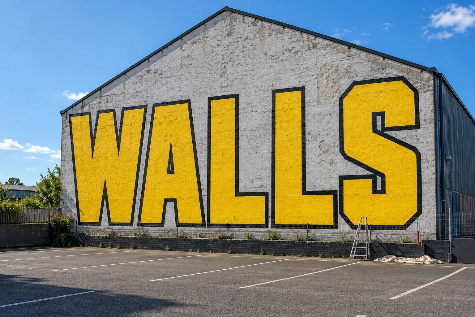
Blockbuster letters are large, square and upright, built to be read from far away and to cover a big surface. They have little decoration: a flat fill, a solid outline and sometimes a simple shadow. Writers often fill them with rollers and only outline with spray, which saves a lot of paint.
The challenge here is not detail but scale. Keep all letters the same height, keep the gaps between them even and check the work from a distance every few minutes; on a large wall, a letter that looks right from one metre away is often visibly off from twenty.
For a first blockbuster, plan letters at least 1.5 metres tall, chalk the outlines on the wall before any paint, fill with a roller and keep the spray cans for the outline only.
Wildstyle: hard to read on purpose
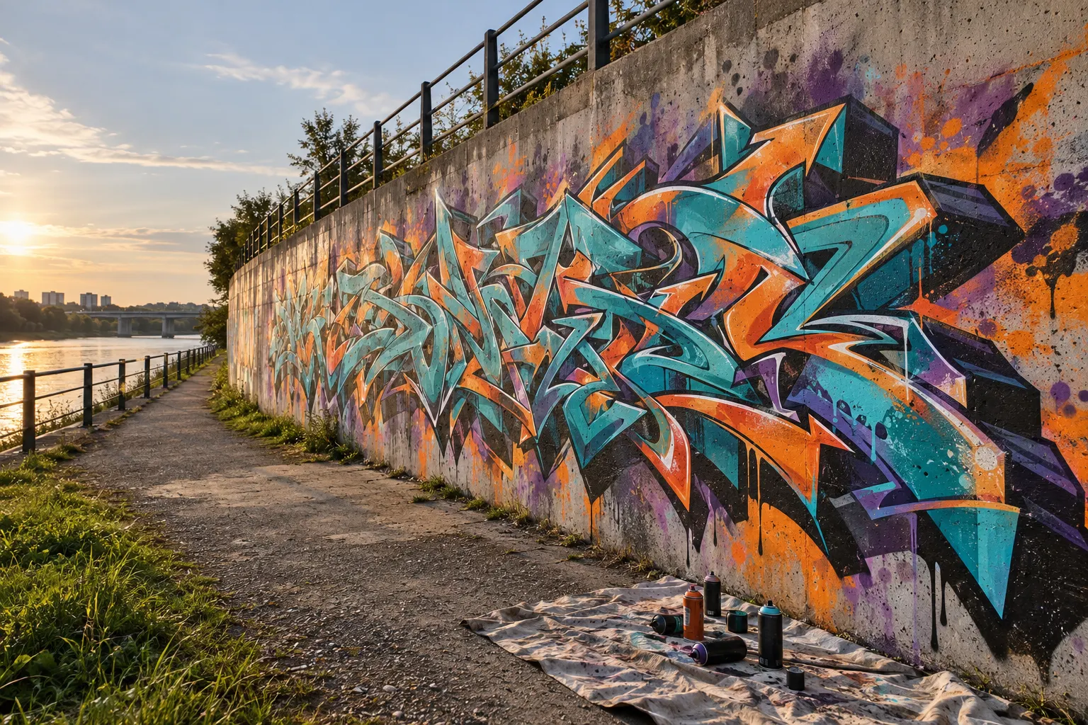
Wildstyle is the most complex lettering style: letters are bent, split, interlocked and extended with arrows, spikes and connections until the word becomes a single structure. It is meant to be hard to read for outsiders, and the challenge for the writer is to keep it readable to someone who knows how the letters were built.
The name became widely known through the New York scene of the 1970s and early 1980s. Today a wildstyle piece usually has fades in the fill, a thick outline, a 3D block shadow and small white highlights.
Do not start a wall with it. Wildstyle is built on top of solid basic letters: if the underlying skeleton is weak, extra arrows only hide the problem for a moment. Our Wildstyle Graffiti Guide covers the construction step by step.
3D style: letters as objects
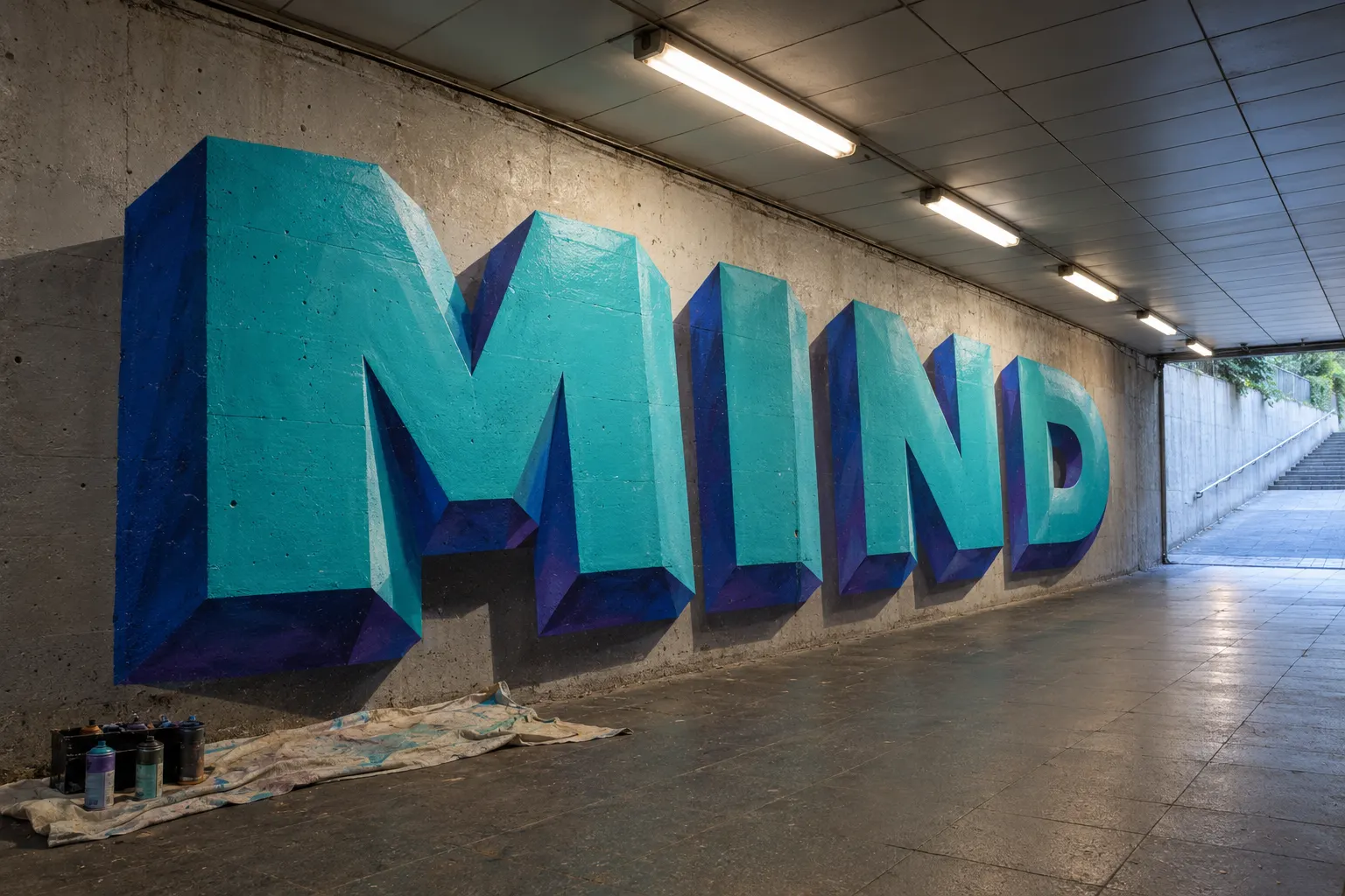
In the 3D style, letters are painted as solid objects with depth, perspective, light and shadow, usually without the black outline that defines most other styles. The letters can look as if they stand out of the wall, as in the example above, where the effect is strong enough to read as real blocks.
Three things make 3D work:
- One light source. Decide where light comes from before you start and keep every face consistent with it: lit faces light, sides mid-tone, undersides dark.
- One vanishing direction. All the depth lines of all letters go the same way.
- Clean edges. Without an outline, the contrast between faces does all the work, so edges need a steady hand or masking tape.
Practise on paper with a single letter in three values (light, mid, dark) before adding colour.
Stencil: cut once, spray many times
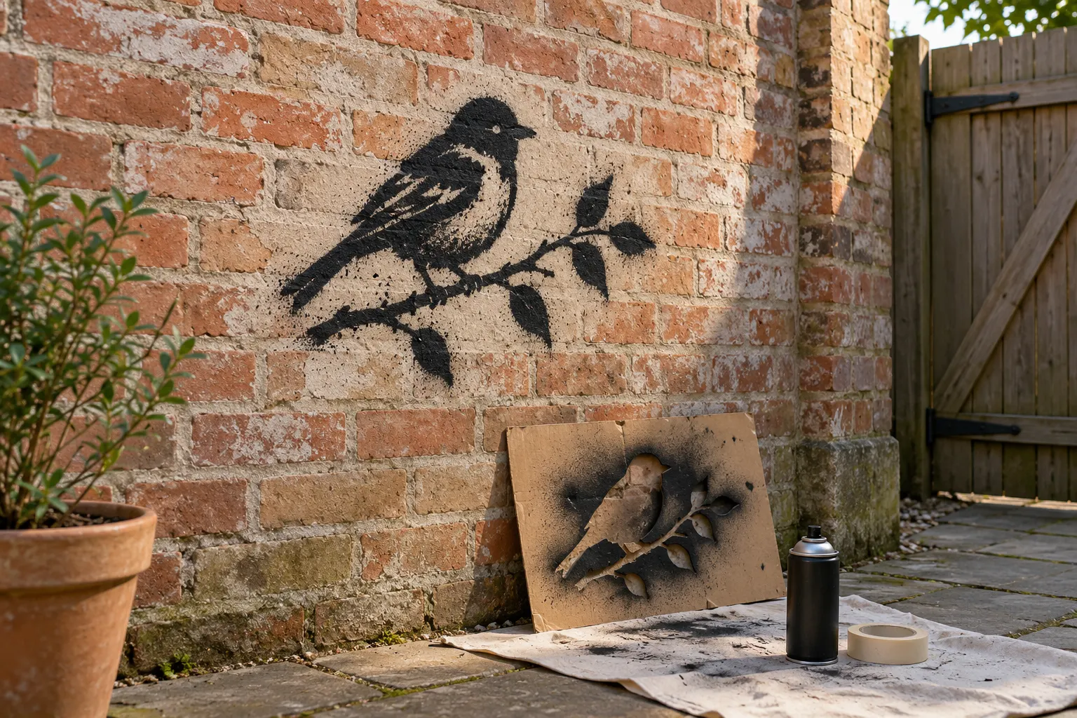
Stencil graffiti uses a template cut from card, plastic or thin board: you hold it against the wall and spray through the openings. The cutting takes time, the spraying takes seconds, and the result has sharp edges with a soft halo of overspray around them.
Two practical rules:
- Bridges. Every island in the design (the middle of an O, the eye of a bird) needs thin connecting strips, or it falls out when you cut it. Plan them into the drawing.
- Light coats. Hold the can 15 to 25 centimetres from the wall and spray two light coats rather than one heavy one; heavy coats run under the stencil and blur the edge.
Card from packaging is fine for a first stencil. Tape the corners, spray, lift straight off and let it dry before reusing it.
Characters: the figure next to the letters
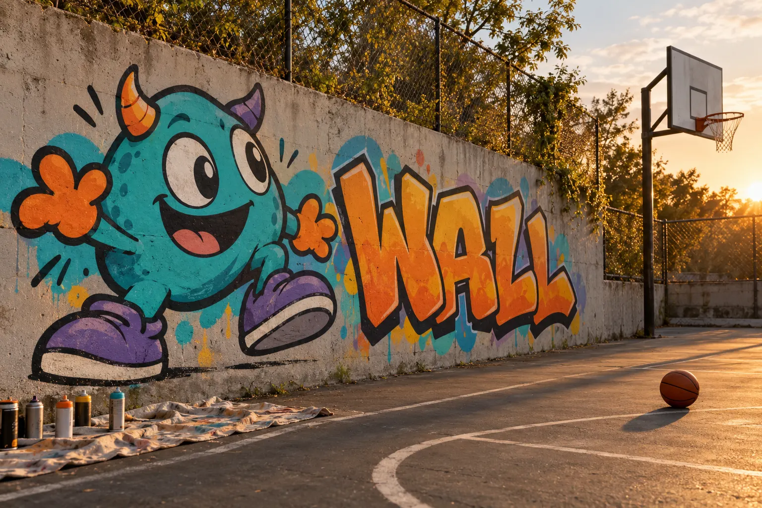
Characters are cartoon figures painted next to (or as part of) a lettering piece: they hold the letters, react to them or simply add a face to the wall. They follow the same rules as letters: a clear silhouette, a bold outline and a bright, simple fill.
Invent your own. A character based on a cartoon or game figure you did not create is someone else's work, and on a public wall it can also be a copyright problem. Start with a simple body shape (a circle or a bean), give it one strong expression and two or three features you can repeat in every drawing, such as horns, oversized shoes or a particular pair of eyes.
In which order to learn them
A practical order that builds each skill on the previous one:
1. Tags and handstyle on paper: letter shapes and line control.
2. Bubble letters: volume, overlap and readable words.
3. Throw-ups: the same letters, painted fast with two colours.
4. Blockbuster: scale, spacing and working on a large surface.
5. Wildstyle: construction, connections and arrows on solid basic letters.
6. 3D: light, perspective and clean edges.
Stencils and characters sit alongside this path rather than on it: you can start either at any point.
Where to practise
Paper and a sketchbook cost almost nothing and are where most of the learning happens. When you are ready for a wall, use a legal one: a designated practice wall, a community wall with a booking system, or a surface where the owner has given you written permission. Our guides How to Find Graffiti Spots and Where Is Graffiti Legal? explain how to find and check them.
FAQ
What is the easiest graffiti style for beginners? Bubble letters. They are round, forgiving and readable, and the skills carry over to throw-ups and later to wildstyle.
What is the difference between a throw-up and bubble letters? Bubble letters are a letter style; a throw-up is a way of painting one. Throw-ups usually use rounded bubble-like letters but are painted fast in two colours, with less care for detail.
Why is wildstyle so hard to read? Because that is the point: the letters are interlocked and extended until the word works as one structure. It still has to be built from real letters, or it is just decoration.
Do I need special paint? For practice, no. Any spray paint made for outdoor use works on a legal wall; artists' cans with low pressure and a range of caps make lines easier to control as you progress.
The images in this article are AI illustrations of invented walls, made to show each style. They do not show real places or real artists' work.