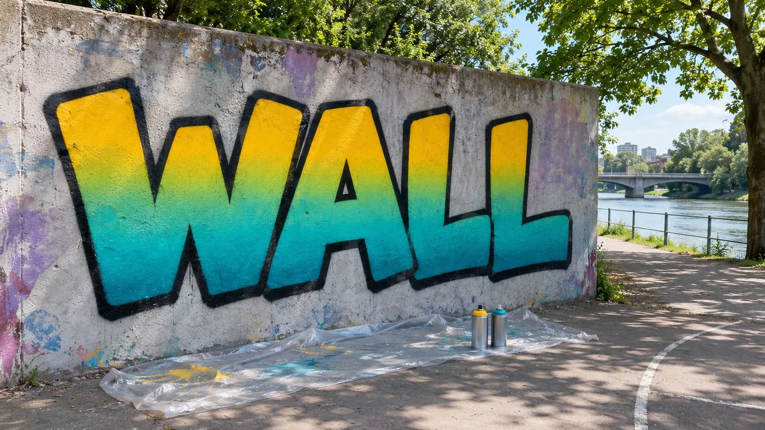
A good graffiti fill gives the outline a stable field to define. A fade adds depth or movement inside that field, but it works only when the base coverage, color order and overlap zone are planned before the wall becomes wet. Start with two colors, keep the transition broad enough to control and paint only on a legal wall or a surface where you have explicit permission.
Flat fill first
Mark the letter boundaries lightly, then choose a consistent direction for the fill passes. Horizontal passes make it easy to track rows; vertical passes may suit tall narrow letters. The direction matters less than keeping it deliberate. Begin each pass moving, overlap the previous pass slightly and release the cap before stopping. This reduces heavy endpoint dots.
Work across the word rather than finishing one small area to perfection. A fill that is complete in one letter and barely started in the next can dry unevenly before you reach the transition. Keep the can at a stable working distance and move at a speed that deposits coverage without flooding the wall. Rough surfaces may need passes from another direction to reach recesses, but avoid holding the spray on one spot.
Check the fill from several steps back. Patchiness that looks severe at arm's length may disappear at reading distance, while a pale band across every letter can become more obvious. Fix the large gaps first. The simple fills in how to draw a graffiti throw-up are useful practice before adding a fade.
Planning a fade
Use two colors for the first exercise. Choose a lighter color and a darker color that can meet without immediately producing an unwanted dull band. Three colors can make a longer transition, but they add another overlap to control. Arrange them light to dark on the ground so the order is clear.
Decide where the fade line will sit across the whole word. A horizontal transition is easiest to keep consistent because one height can be checked from letter to letter. Mark the intended blending zone in the sketch rather than treating it as a razor-thin line. The fade happens across an area: one color becomes less dominant while the other becomes more dominant.
Test the pair on cardboard or a permitted patch. Some pigments cover another color more aggressively, and similar-looking test swatches can behave differently on the wall. The test should tell you which color needs the stronger base and how wide a soft pass appears at a greater distance.
Painting a two-colour fade
First establish the lighter base through the upper area and extend it beyond the planned transition. It is usually easier to preserve brightness when the light color has coverage before the dark color arrives. Keep the lower edge of this area loose; a hard boundary creates a stripe that the second color must hide.
Apply the darker color from the opposite side, building normal coverage in the lower area. As you approach the transition, move slightly farther from the wall so the pattern becomes wider and softer. Keep the can moving and use lighter passes. Let the overspray enter the light base gradually instead of drawing a solid dark line across it.
Return with the light color from above if the dark band climbs too far. Again, soften the spray by increasing distance and movement rather than stopping over the boundary. Alternate only as much as needed. Too many wet passes can make the overlap heavy and visually muddy. The goal is a controlled exchange, not a perfectly airbrushed surface.
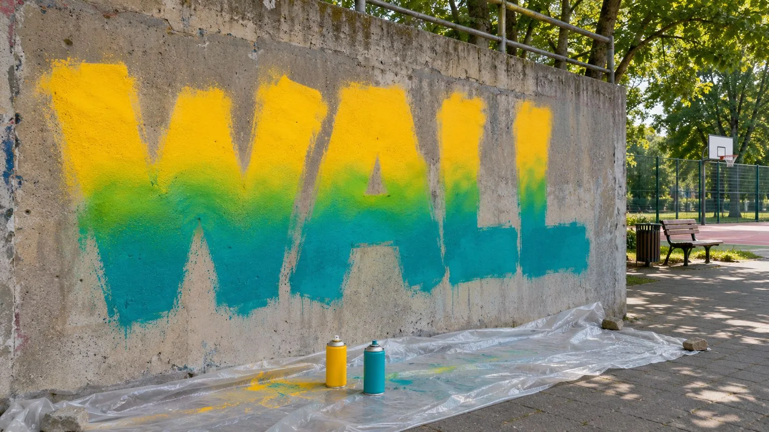
Keep the same transition height through counters and narrow strokes. Step back after each pass across the word. If one letter changes color much higher than its neighbour, correct the zone while the overall structure is still visible.
Common fill and fade problems
Banding appears when the colors meet in a hard stripe. It often comes from painting both colors up to the same exact edge or working too close in the overlap. Soften the band with a light pass from slightly farther away, extending the transition on both sides rather than covering the stripe with another solid stripe.
Muddy overlap happens when too much wet paint accumulates or the chosen colors neutralize into an unwanted dull mixture. Stop adding paint and let the surface settle. When it is ready for another pass, rebuild the cleaner color from its side and reduce the number of alternations. If the test panel already produced mud, choose a different pairing or add a planned middle color rather than forcing the combination.
Patchiness comes from gaps between passes, inconsistent speed or a textured surface. Refill the larger gaps with the appropriate local color, then re-soften only the part of the transition affected. Do not repaint the whole fade for one small thin area.
Drips indicate excess wet paint, often from pausing, moving too slowly or working too close. Stop feeding the drip. Let it settle, then decide whether the outline or a later controlled pass can absorb it. Chasing a wet drip immediately often widens the damage.
Before the outline
Wait until the fill has set enough that the outline will sit on the surface rather than mix into wet color. The required wait varies with paint, temperature, humidity, wall absorption and film thickness, so judge the test area and follow the product's directions instead of using one universal time. A surface can look matte while a heavy overlap remains soft.
Step back and inspect the word before outlining. Check the fade height, remaining bare patches, counters and overall readability. Make a few necessary fill corrections, then stop. The construction approach in graffiti block letters for beginners helps keep the letter skeleton visible under color.
Add the outline only after the fill is stable enough for a clean edge. Use the contour to recover crisp letter boundaries rather than tracing every irregular patch inside the fill. Keep ground protection in place, take every can and cap away, and verify the wall's current permission through the legal graffiti spots guide.