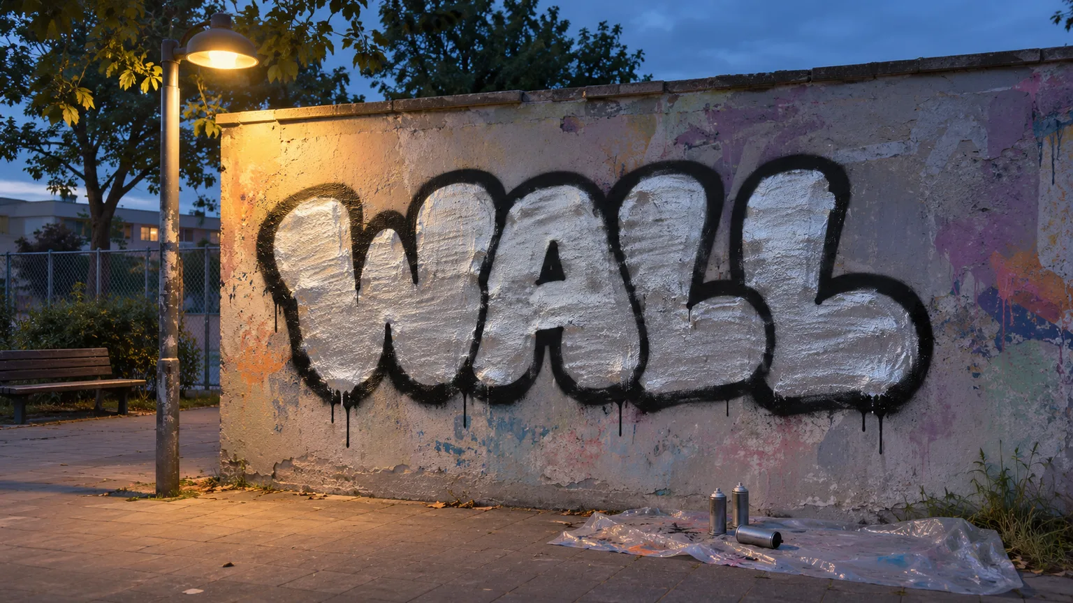
A throw-up sits between a quick lettering exercise and a developed piece. The useful goal for a first attempt is not complexity. It is a short word whose shape you can repeat without stopping to redesign every letter. Work it out on paper, take that same drawing to a wall where painting is permitted, and keep the sequence simple: fill, outline, then cut-back.
What makes a throw-up a throw-up
A throw-up uses rounded, chunky letters, usually one fill colour and one outline colour. The letters often touch or lean into one another so the word reads as one compact shape. Compared with the forms in how to draw bubble letters, a throw-up is designed around a faster painting rhythm: fewer interior details, fewer colour changes and a silhouette you can remember.
Bubble letters are a drawing foundation, not automatically a throw-up. You can spend time correcting each bubble letter on paper, while a throw-up asks you to simplify those forms into a repeatable word. A full piece goes in the other direction. It may include several outlines, highlights, backgrounds, characters or more complex letter structure. The overview of types of graffiti styles helps place these approaches next to one another.
Your first test is readability at a glance. If the letters only make sense after you explain them, simplify the joins and open the counters before adding style.
Choosing a word and sketching it
Start with a word of three to five letters. That range is long enough to practise rhythm but short enough to remember as a single movement. Use a word you have permission to paint and avoid copying another writer's name. Write it in plain capitals first, then wrap a rounded mass around each letter.
Let neighbouring letters lean on each other, but keep the main stems identifiable. Look at the whole silhouette rather than polishing one letter at a time. If the first letter is wide and the last is narrow, adjust the middle letters until the word feels balanced. Repeat the same word across a page. Each attempt should preserve the basic skeleton while removing fussy bumps, gaps and extensions.
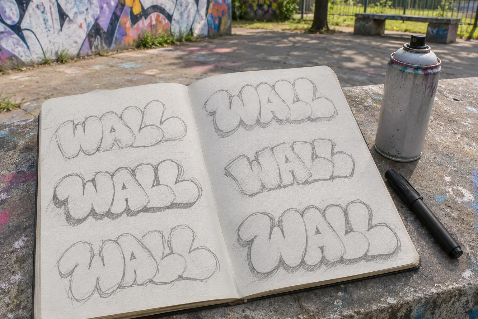
A useful paper drill is five repetitions without erasing. After each one, mark only one change for the next attempt: a wider counter, a simpler join or a more even baseline. By the fifth drawing, you should be able to make the main outline without referring to the first.
Two colours and the right cans
Choose a light fill and a dark outline. Strong value contrast keeps the word readable even when the fill is rough or the wall is visually busy. Silver with black is an obvious practice pairing, but the principle matters more than the specific colours: squint at the two swatches, and they should still separate clearly.
A wider cap can cover the fill with fewer passes. A thinner cap gives more control around the outer contour and tight joins. Test both on a permitted patch of the same surface before starting the word. The wall's texture, the can's pressure and the cap all change the mark, so a paper sketch cannot tell you exactly how the paint will behave.
Painting it in order
Sketch only the guides you need. Then paint the rough fill first, moving across the whole word instead of finishing one letter at a time. The fill can stop just inside the intended edge; the outline will cover that margin. Aim for usable coverage, not a perfectly polished field.
Next, add the dark outline in one continuous visual pass. Keep checking the whole word from a few steps back so one letter does not become much heavier than the rest. Finish with a quick cut-back: use the fill colour to trim an overshoot, reopen a counter or sharpen a join where the outline wandered inward. Cut-back is correction, not a second complete fill.
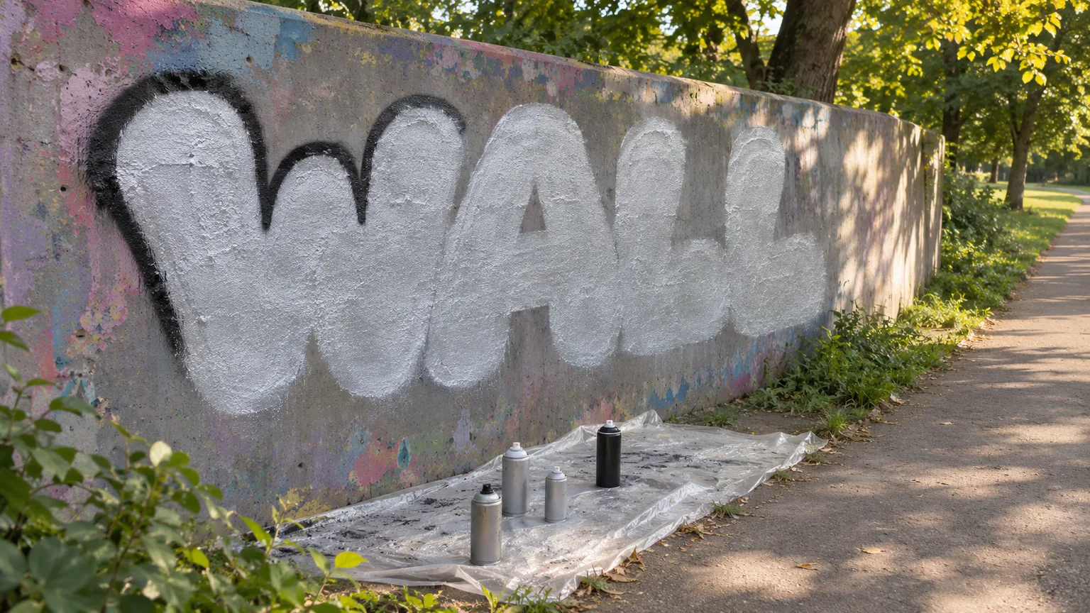
Begin roughly 15 to 20 cm from the wall and adjust after the test mark. Moving too close concentrates wet paint in a small area, making heavy edges and drips more likely. Moving farther away softens and widens the mark, and more paint can miss the target. Keep the can moving before pressing the nozzle, release it before stopping, and overlap fill passes rather than holding the spray on one spot. Treat the distance as a starting range, because cap, pressure, weather and surface texture change the result.
Practising speed without cutting corners
Speed should come from familiarity, not from skipping permission, surface checks or protection. On paper, time one clean repetition of the word, inspect it, choose one correction and repeat. Do not chase a record on every round. Compare whether the baseline, letter widths and counters stay consistent while the drawing becomes more fluent.
On a legal wall, use the same routine across separate permitted panels or sessions. Photograph each finished attempt straight on, then compare the silhouette and joins. Fix one recurring problem in the next sketch before painting again. A simple log can record which cap you used and which adjustment helped; it does not need invented precision.
Where to paint it
Paint only on a legal wall or on a surface for which you have clear permission. Check the site's current rules, permitted area and opening times before unpacking; a wall that was once available may not be available now. Protect the ground, keep paths clear and take every can, cap and sheet away with you. The legal graffiti spots guide explains what to verify before treating any wall as a practice space.