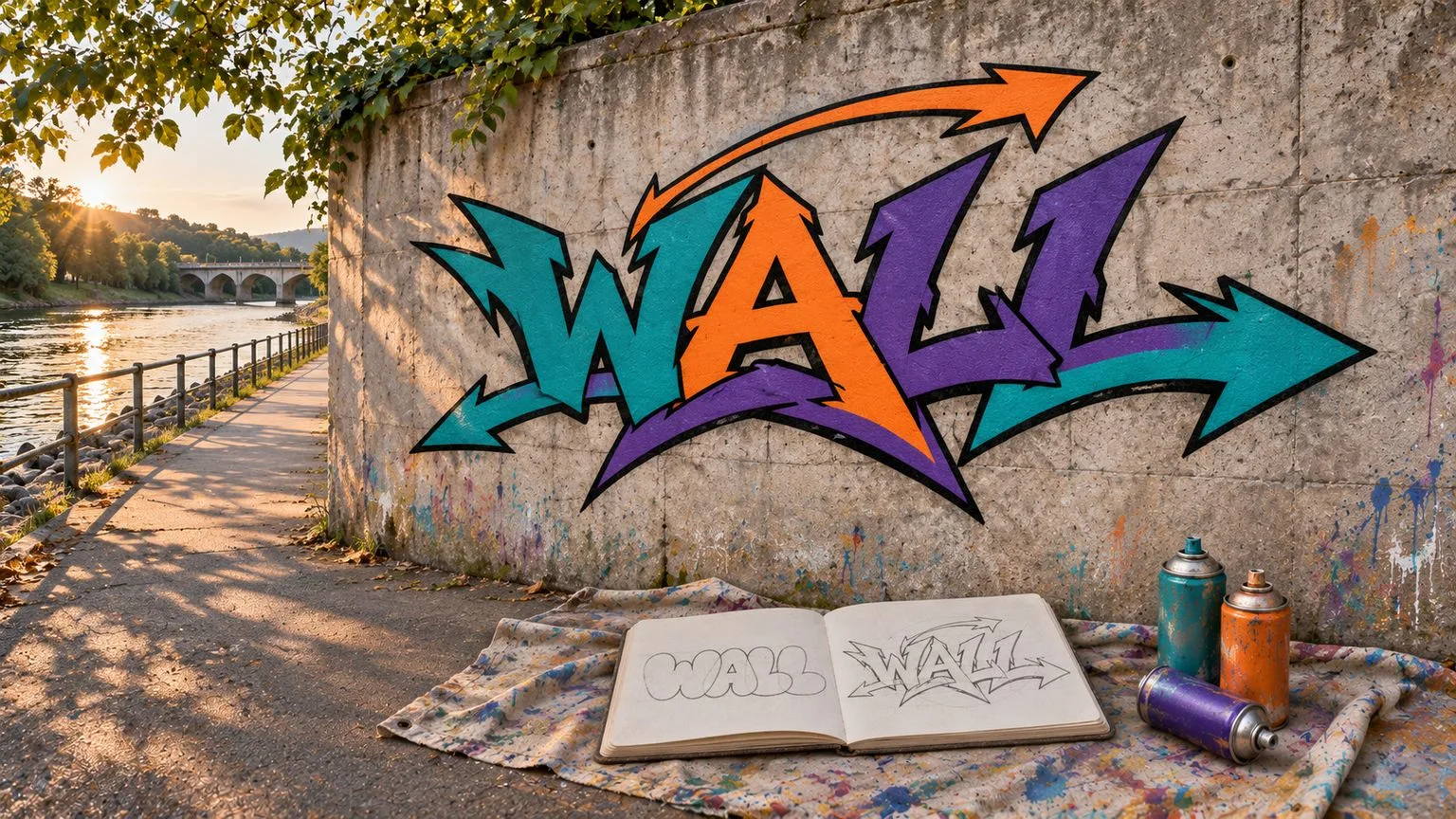
Graffiti letters are not simply ordinary type made louder. A lettering style is a set of choices about how each letter is constructed, spaced, connected and read on a wall. Straight letters, bubble letters and wildstyle can all begin with the same simple skeleton, yet they produce very different silhouettes. Understanding that shared foundation is more useful than treating each style as an unrelated font.
What lettering style means in graffiti
When painters talk about a lettering style, they are describing structure as much as appearance. The strokes can become upright bars, rounded tubes or interlocking segments without necessarily changing which letter sits underneath. A style becomes convincing when those decisions remain consistent across a whole word.
Take the simple word WALL. Its strong W, open A and repeated Ls provide a useful common reference. The letters remain recognisable characters even as their contours and relationships change. There are neighbouring forms such as throw-ups and three-dimensional treatments, but this comparison is specifically about letter construction. The overview of graffiti styles gives the broader context.
The skeleton: the letter under every style
A skeleton is the simplest readable line path through a letter, before its body becomes thick or decorative. Think of it as the route that a pencil would trace to indicate a W, A or L with minimal marks. The baseline is the common imaginary line on which the letters stand. Letter height gives them a shared vertical presence; spacing determines how separate or connected their bodies look.
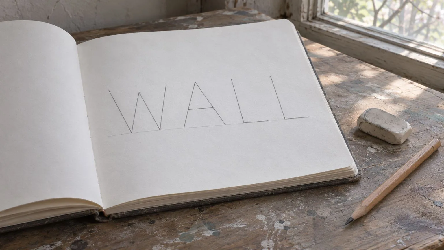
A weak skeleton creates trouble in every later version. A stretched A can appear unrelated to the W; the Ls can lean at contradictory angles; overlapping bodies may conceal which letter comes first. A strong skeleton does not require identical widths, but it maintains a consistent relationship between characters. Even a complex wildstyle design should leave traces of this underlying order.
Straight letters: upright, square, even
In straight or block letters, the skeleton gains a solid body with mostly vertical strokes and flat tops and bottoms. The letter faces feel aligned, and the gaps between neighbouring letters are deliberately even. This often makes a straight-letter piece the easiest of the three to read from a path or across a legal practice wall.
For WALL, the W keeps its clear angular peaks, the A retains a visible counter, and the repeated Ls provide a regular ending rhythm. The proportion is relatively stable: the bodies feel equal in weight even though their natural widths differ. The rhythm comes from repeating uprights and gaps rather than flowing curves.
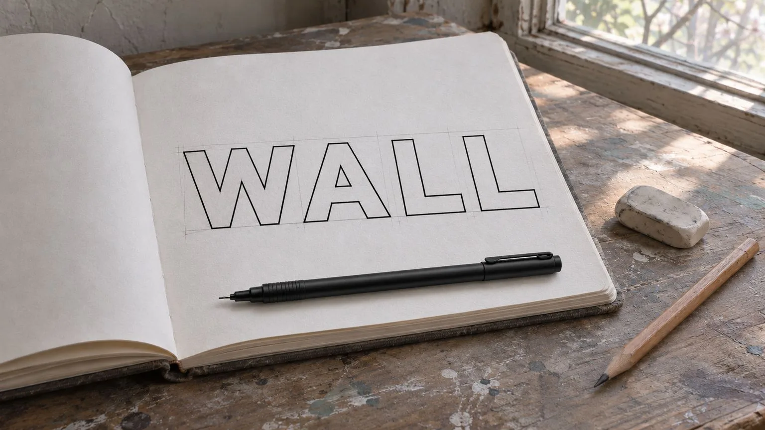
Straight does not mean careless. The W can easily become too dense beside the A, and the Ls may look narrow unless their horizontal feet are considered as part of the whole word. The block-letter guide explores that construction in more detail.
Bubble letters: the same skeleton, inflated
Bubble letters wrap rounded forms around the original paths. Hard corners become curves, strokes swell into tube-like volumes, and neighbouring letters may overlap slightly. Their counters (the internal open areas in letters such as A, B, D, O, P and R) must still leave enough negative space to keep the letters distinct.
In the bubble version of WALL, the W expands into soft lobes and the Ls become broad rounded elbows. The proportions look wider and more playful than the straight version. Rhythm comes from repeated curves and gentle overlap rather than uniform rectangular spacing. That overlap can give the word cohesion, but an overfilled A counter can quickly reduce readability.
Bubble letters are not inherently childish or less controlled. They place the challenge somewhere else: maintaining a clear letter identity while the borders become elastic and adjacent bodies begin to touch. See how to draw bubble letters for a fuller discussion of their contours.
Wildstyle: the skeleton bent and connected
Wildstyle can split letter bodies, extend selected strokes, interlock neighbouring shapes and add arrows or connecting bars. These extensions can create a shared composition that reads as a single flowing unit rather than separate characters. Readability is deliberately reduced, but it should not become completely arbitrary: the skeleton must remain traceable for a viewer willing to follow it.
On WALL, an extension from the W might connect visually with the A; the repeated L strokes might become a strong directional ending. Arrows can reinforce the movement, but they should follow the structure rather than distract from it. The proportions become more irregular, rhythm travels through connections instead of regular gaps, and the sequence of letters can take longer to decode.
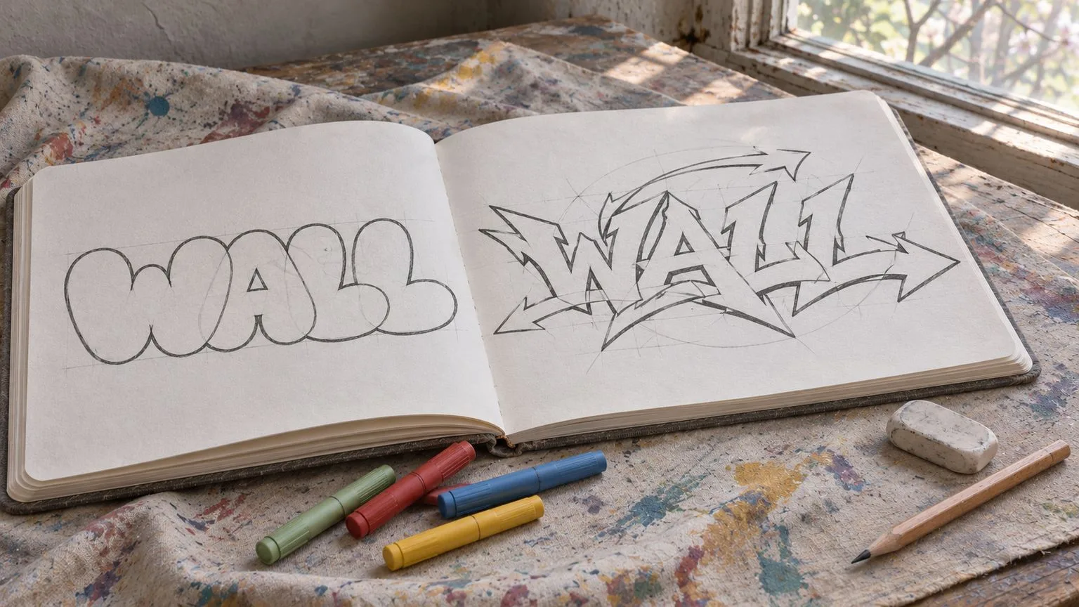
The difficulty is not how many arrows can fit. It is whether a reader can still reconstruct the word from the underlying stems. If the A disappears entirely or the Ls cannot be distinguished from ornamental strokes, the composition may be energetic but cease to function as lettering. The wildstyle graffiti guide covers more advanced considerations.
Comparing the three: proportion, rhythm, readability
| Style | Proportion | Rhythm | Readability | |---|---|---|---| | Straight | Upright, similar visual weight | Repeated bars and regular gaps | Usually immediate | | Bubble | Wider, soft rounded bodies | Curves and controlled overlaps | Clear if counters stay open | | Wildstyle | Distorted and interlocked | Directional links and extensions | Deliberately slower |
Try a simple reading check on your own sketch: place the page where you cannot study every detail, then glance at it as a stranger might. Can you identify WALL without already knowing what it says? Better still, show it to someone who has not seen the drawing before. Difficulty reading may be intentional in wildstyle, but total loss of the letter skeleton is still a design decision worth questioning.
A 3D shadow can be added to any of these families, and a throw-up often relates to rounded quick lettering; neither changes the shared underlying alphabet. Keep the styles separate from finishing effects when comparing them.
From sketchbook to a legal wall
A sketchbook comparison helps reveal which lines carry the word and which marks merely decorate it. On a wall, viewing distance, surface texture and surrounding colours can make those decisions more apparent. The most complex drawing is not always the strongest mural.
Paint only on a designated legal wall or with the wall owner's permission. Check local rules before carrying the sketch to a site; the legal graffiti spots guide explains what to verify. The wall is where composition, colour and lettering meet a real surrounding place, not a blank digital canvas.